
Understanding what is data analysis and visualization has become essential in nearly every industry today. As organizations collect more information than ever before, the ability to interpret and present that data clearly separates good decision-making from guesswork. In simple terms, data analysis and visualization refers to the process of examining raw data and then presenting the findings through visual formats like charts, graphs, and dashboards.
Many professionals search for what is data analysis and visualization because the two terms are often used together, yet they represent distinct steps in the research process. Data analysis focuses on extracting insights from numbers, while visualization focuses on communicating those insights clearly. This guide explains both concepts in detail, along with practical techniques and tools to help you apply them effectively.
Understanding Data Analysis
Data analysis is the process of inspecting, cleaning, and interpreting data to uncover useful information and support conclusions. It involves identifying patterns, trends, and relationships within a dataset. Before visualization even comes into play, analysts must first make sense of raw numbers through statistical methods and structured techniques.
Since data rarely arrives in a clean, ready-to-use format, how we analyze data starts with organizing and validating the information. Analysts remove duplicates, handle missing values, and standardize formats before running any calculations. Only after this preparation stage can meaningful insights emerge from the dataset.
Understanding Data Visualization
Data visualization is the graphical representation of information and data. Using visual elements like charts, graphs, and maps, visualization tools make it easier to see and understand trends, outliers, and patterns within data. Moreover, it provides an accessible way to present findings to non-technical audiences without overwhelming them with raw numbers.
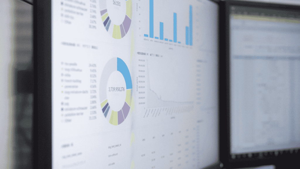
In the world of large-scale data, visualization tools have become essential for making sense of massive datasets quickly. Instead of scanning thousands of rows in a spreadsheet, decision-makers can glance at a chart and immediately grasp the story the data tells. This is why understanding what is data analysis and visualization together is matters – one interprets the data, and the other communicates it.
Turn Survey Data Into Business Decisions Faster
Technology-driven market research for faster, smarter insights.
Why Data Analysis and Visualization Work Together
Data analysis and visualization aren’t separate, isolated processes; they complement each other throughout the research or business intelligence workflow. Consider these reasons why the two go hand in hand:
- Analysis uncovers the insight, while visualization makes it understandable.
- Visualization highlights outliers that might otherwise get lost in a large dataset.
- Analysis validates the numbers, ensuring visualizations aren’t built on flawed data.
- Together, they support faster decisions by turning complex data into a clear narrative.
- Both improve communication between technical teams and non-technical stakeholders.
Therefore, skipping either step weakens the outcome. A beautiful chart built on poor analysis can mislead viewers, while accurate analysis without visualization often fails to reach or influence decision-makers effectively.
Advantages of Data Analysis and Visualization
There are clear benefits to mastering what is data analysis and visualization as a combined skill set:
- Faster comprehension: Visuals help people grasp trends instantly instead of digging through rows of numbers.
- Better decision-making: Clear insights lead to more confident, data-backed choices.
- Improved communication: Stakeholders across departments can understand findings regardless of technical background.
- Pattern recognition: Visualization reveals correlations and trends that raw data often hides.
- Increased engagement: Interactive dashboards keep audiences engaged during presentations.
However, there are limitations to keep in mind as well. Poorly designed visualizations can misrepresent data, and correlation shown in a chart doesn’t always indicate causation. Consequently, both careful analysis and thoughtful design are necessary to avoid misleading conclusions.
Common Types of Data Visualizations
Once analysis is complete, choosing the right visualization format is critical for clear communication. Some of the most widely used types include:
- Bar charts: Compare numerical values across categories.
- Line graphs: Show trends over time.
- Pie charts: Display proportions as a percentage of a whole.
- Heat maps: Use color to represent data intensity across a matrix or map.
- Histograms: Show the distribution of continuous data across defined bins.
- Dashboards: Combine multiple visualizations into a single, interactive view.
For example, when analyzing frequency distributions, many analysts rely on a step-by-step guide for creating a histogram in Excel using data analysis tools, since histograms make it easy to spot skewness or unusual clusters in a dataset.
The Data Analysis and Visualization Process
Understanding what is data analysis and visualization in practice is requires following a structured workflow. Here’s how the process typically unfolds:
Step 1: Define your objective. Clarify what question you’re trying to answer before touching any data. A clear objective shapes every decision that follows.
Step 2: Collect and clean the data. Gather relevant data from surveys, databases, or existing sources, then remove errors and inconsistencies.
Step 3: Analyze the data. Apply statistical techniques to identify patterns, relationships, and trends within the dataset.
Step 4: Choose the right visualization. Select a chart type that best represents your findings – bar charts for comparisons, line graphs for trends, and so on.
Step 5: Build and refine the visualization. Design the chart or dashboard with clarity in mind, avoiding clutter or unnecessary complexity.
Step 6: Interpret and share the results. Present the findings with context, explaining what the data means for the audience.
This structured approach ensures that visualizations remain accurate and meaningful rather than just decorative. Ultimately, following a consistent data analysis and interpretation approach for quantitative research strengthens both the credibility and clarity of your findings.
Turn Complex Datasets Into Strategic Business Growth
Enterprise-grade data processing, statistical analysis, and customized tabulations to power your insights.
Popular Tools for Data Analysis and Visualization
Choosing the right software significantly impacts the quality and efficiency of your work. Several tools are widely used across industries:
- Excel – Ideal for basic analysis, pivot tables, and simple charts.
- Tableau – A leading tool for building interactive dashboards and advanced visualizations.
- Power BI – Popular for business intelligence reporting and predictive insights.
- SPSS – Common in academic and market research for statistical testing.
- Python and R – Used for advanced statistical analysis and custom visualizations.
Exploring various data analysis tools helps professionals determine which platform best fits their skill level and project requirements. For teams working with forecasting or trend prediction, understanding whether Power BI can do predictive analytics can also guide tool selection for more advanced reporting needs.
Data Analysis and Visualization in Market Research
Businesses frequently rely on data analysis and visualization to understand customer behavior, market trends, and competitive positioning. In market research specifically, visualizing survey results or sales data helps teams quickly identify shifts in consumer preferences.

Different industries apply different data analysis techniques in market research, ranging from simple cross-tabulations to more advanced predictive models. Regardless of the technique, visualizing the results afterwards ensures that findings are communicated clearly to stakeholders who may not have a statistical background.
Excel-Based Data Analysis Techniques
For smaller datasets or quick exploratory work, Excel remains a go-to tool for combining analysis with basic visualization. Beyond standard charts, Excel offers features that support deeper scenario analysis. For instance, using what-if analysis in Excel data tables allows analysts to test different variable combinations and immediately see how outcomes change – a useful technique for budgeting, forecasting, and sensitivity testing.
This kind of built-in flexibility makes Excel a practical starting point before moving to more specialized visualization software for larger or more complex datasets.
Reporting Your Findings Effectively
After analysis and visualization are complete, the final step involves presenting the results in a clear, organized format. A strong report should include:
- A summary of key findings at the beginning for quick reference.
- Supporting visuals placed alongside relevant explanations.
- Context for each insight, explaining its business or research implications.
- Limitations or assumptions that may affect the interpretation of results.
Following a structured data analysis report format ensures that stakeholders can quickly understand both the findings and their significance, rather than getting lost in technical detail.
Common Mistakes to Avoid
Even skilled analysts sometimes make errors that reduce the effectiveness of their work. Watch out for these common pitfalls:
- Choosing the wrong chart type, which can distort how data is perceived.
- Overcrowding visuals with too many variables or colors.
- Skipping data cleaning, leading to inaccurate results.
- Confusing correlation with causation when interpreting patterns.
- Ignoring the audience’s technical background when designing reports.
Additionally, many people confuse the terms “data analysis” and “data analytics,” assuming they mean the same thing. Understanding the difference between data analysis and data analytics clarifies that analysis focuses on interpreting specific datasets, while analytics often refers to the broader, ongoing use of data across an organization.
Program Complex Questionnaires and Skip Logic
Expert survey scripting, advanced routing, and multi-language configurations for flawless data collections.
Conclusion
So, what is data analysis and visualization? Together, they form the backbone of modern decision-making – analysis uncovers the story hidden within raw numbers, while visualization tells that story clearly and persuasively. Mastering both skills allows researchers, marketers, and business leaders to move from confusing spreadsheets to confident, data-driven conclusions. As data continues to grow in volume and complexity, the ability to analyze and visualize it effectively will only become more valuable.
Frequently Asked Questions
Data analysis involves examining and interpreting data to find patterns and insights, while data visualization focuses on presenting those insights graphically for easier understanding.
Excel is a great starting point due to its accessibility, while Tableau and Power BI are better suited for more advanced, interactive visualizations.
Visualization allows decision-makers to quickly grasp trends and patterns without analyzing raw data manually, leading to faster and more informed decisions.
Yes, poorly designed charts or misrepresented scales can distort the true meaning of data, which is why careful design and accurate analysis are equally important.
Key skills include statistical knowledge, familiarity with tools like Excel, Tableau, or Power BI, attention to detail, and the ability to communicate findings clearly to different audiences.