Excel remains one of the most accessible tools for running statistical analysis, and regression is no exception. Knowing how to use data analysis regression in Excel allows anyone, from students to business analysts, to uncover relationships between variables and forecast future outcomes without needing specialized statistical software.
In this guide, we’ll walk through exactly how to use data analysis regression in Excel, step by step. We’ll also cover how to interpret the results, common mistakes to avoid, and how regression fits into the broader analytics toolkit available within Excel. At Linkinfotech, we help businesses and researchers apply techniques like regression analysis to real datasets, turning statistical output into insights that support confident, data-driven decisions.
What Is Regression Analysis in Excel?
Regression analysis measures the relationship between one or more independent variables and a dependent variable you’re trying to predict. In Excel, this typically means examining how changes in one factor, such as advertising spend, relate to changes in another, such as sales revenue.
Learning how to use data analysis regression in Excel gives you the ability to quantify these relationships numerically, rather than relying on guesswork or visual estimation from a chart. The output includes coefficients, statistical significance values, and an overall measure of how well the model fits your data.
Excel offers two primary ways to run regression: through the built-in Data Analysis ToolPak, or by using statistical functions like LINEST and SLOPE directly within worksheet cells. Most users find the ToolPak approach far more straightforward, especially when working with multiple variables.
Why Learn Regression Analysis in Excel?
Excel’s accessibility makes it an appealing starting point for regression analysis, especially compared to more complex statistical software. Here’s why learning how to use data analysis regression in Excel is worth the investment.
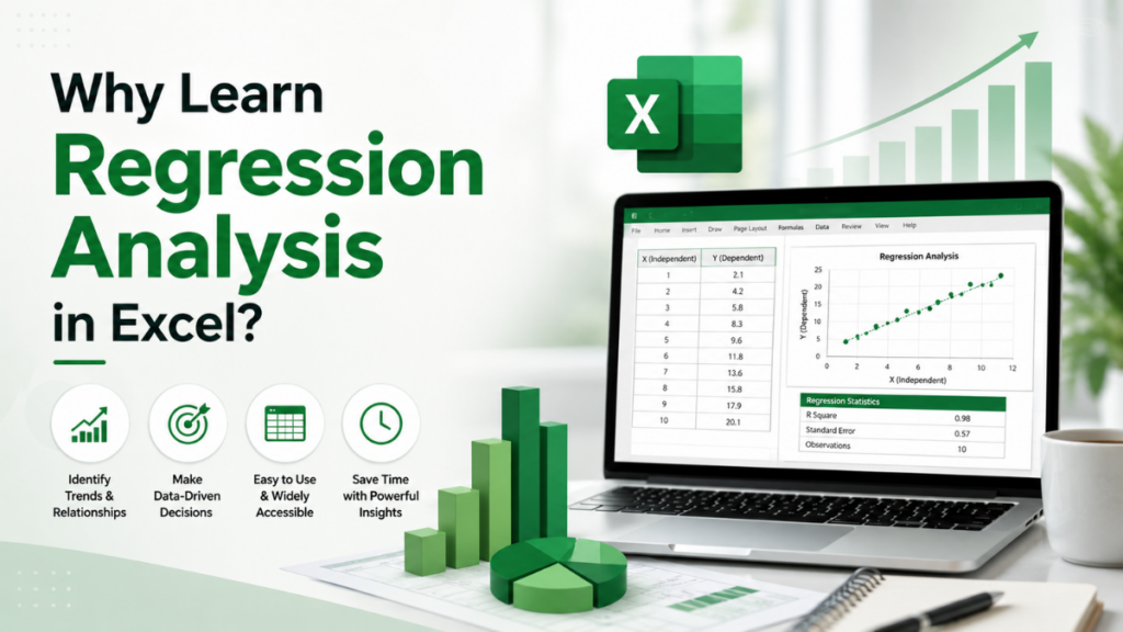
- It’s widely available, since most professionals already have Excel installed
- It doesn’t require programming knowledge or specialized statistical training
- It integrates seamlessly with data you likely already store in spreadsheets
- It produces clear, visual outputs that are easy to share with stakeholders
- It supports both simple and multiple regression models within the same tool
Because of this accessibility, regression in Excel has become a common entry point before analysts move on to more advanced platforms for larger, more complex datasets.
Turn Survey Data Into Business Decisions Faster
Technology-driven market research for faster, smarter insights.
Enabling the Data Analysis ToolPak
Before you can run regression, you need to activate Excel’s Data Analysis ToolPak, since it isn’t enabled by default in most installations.
Here’s how to enable it:
- Open Excel and click on File, then select Options
- Choose Add-ins from the left-hand menu
- At the bottom, select Excel Add-ins from the “Manage” dropdown, then click Go
- Check the box next to Analysis ToolPak and click OK
- Confirm the Data Analysis option now appears under the Data tab
Once enabled, this toolpak stays available for future sessions, so you only need to complete this step once.
Step-by-Step: How to Use Data Analysis Regression in Excel
Now that the ToolPak is active, let’s walk through the actual process of running a regression analysis.
Step 1: Organize Your Data
Arrange your data in columns, with your dependent variable, the value you want to predict, in one column and your independent variable, or variables, in adjacent columns. Clean, well-organized data prevents errors later in the process.
Step 2: Open the Regression Tool
Navigate to the Data tab, click Data Analysis, then select Regression from the list of available tools, and click OK.
Step 3: Define Your Input Ranges
In the Regression dialog box, set the Input Y Range to your dependent variable column, and the Input X Range to your independent variable column or columns. Make sure to select consistent row ranges across both.
Step 4: Choose Output Options
Decide where you want the results displayed, either on a new worksheet or within the existing one. You can also select additional options, such as residual plots, which help visualize how well the model fits your data.
Step 5: Run the Analysis
Click OK, and Excel will generate a detailed output table containing coefficients, R-squared values, and statistical significance measures for your regression model.
Understanding the Regression Output
Once you’ve learned how to use data analysis regression in Excel, interpreting the results becomes the next critical skill. The output table can look intimidating at first, but a few key values matter most.
- R Square – Indicates how much of the variation in your dependent variable is explained by your independent variable, with values closer to 1 indicating a stronger fit
- Coefficients – Show how much the dependent variable changes for each one-unit change in the independent variable
- P-value – Helps determine whether a variable’s relationship with the outcome is statistically significant
- Standard Error – Measures the average distance between observed values and the regression line’s predicted values
- Significance F – Indicates the overall statistical significance of the entire regression model
Understanding these outputs is essential, since running the analysis correctly means little if the results aren’t interpreted accurately.
Simple vs. Multiple Regression in Excel
Excel supports both simple and multiple regression models, and understanding the difference helps you choose the right approach for your data.
Simple regression examines the relationship between exactly one independent variable and one dependent variable. For example, predicting sales based solely on advertising spend. Multiple regression, meanwhile, incorporates several independent variables simultaneously, such as predicting sales based on advertising spend, pricing, and seasonality together.
Multiple regression generally provides a more complete picture of complex, real-world relationships, though it also requires more careful interpretation, since interactions between variables can complicate the results.
Regression vs. Correlation in Excel
It’s easy to confuse regression with correlation, since both examine relationships between variables. However, they answer different questions and serve different analytical purposes.
Correlation measures the strength and direction of a relationship between two variables, without predicting specific outcomes. Regression, however, goes further by building a predictive model that estimates actual values. Understanding the distinction between correlation and regression analysis clarifies when each technique is appropriate, since correlation alone can’t tell you how much a dependent variable will change given a specific input.
If you’re specifically looking to measure relationship strength rather than build a predictive model, it’s worth reviewing how to perform correlation analysis in Excel as a complementary first step before committing to a full regression model.
Program Complex Questionnaires and Skip Logic
Expert survey scripting, advanced routing, and multi-language configurations for flawless data collections.
Visualizing Regression Results
Numbers alone don’t always tell the full story. Visualizing your regression results, particularly through scatter plots with trendlines, makes patterns and outliers much easier to spot.
Excel allows you to add a trendline directly to a scatter chart, along with the equation and R-squared value displayed on the chart itself. This visual approach pairs well with other exploratory techniques, such as building a histogram using Excel’s Data Analysis tools, which helps confirm your data’s distribution before running a regression model in the first place.
Common Mistakes When Running Regression in Excel
Even straightforward tools like Excel’s regression feature can produce misleading results if used incorrectly. Watch for these common mistakes:
- Ignoring outliers – Extreme values can distort coefficients and reduce model accuracy
- Overlooking multicollinearity – Using highly correlated independent variables together can skew results
- Misinterpreting R-squared – A high R-squared doesn’t necessarily mean the model is useful for prediction
- Skipping data cleaning – Missing or inconsistent values can produce inaccurate regression output
- Assuming causation – A significant regression result shows a relationship, not necessarily a cause-and-effect connection
Avoiding these pitfalls ensures your regression analysis produces results you can actually trust and act on.
When to Use Excel vs. Other Statistical Tools
While Excel handles basic and even moderately complex regression well, it does have limitations compared to dedicated statistical software. Very large datasets, advanced diagnostic tests, or highly specialized regression types often require more robust platforms.
Understanding the broader landscape of available data analysis tools helps you decide when Excel is sufficient and when a project genuinely calls for something more specialized. For many everyday business questions, however, Excel’s regression capabilities are more than adequate.
Preparing Data for Regression Analysis
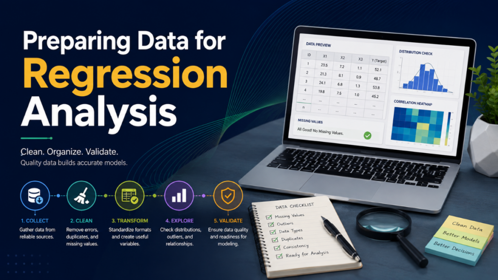
Clean, well-structured data is the foundation of any reliable regression model. Before running your analysis, make sure your dataset is free of missing values, formatted consistently, and organized clearly by variable.
If your data originated outside Excel, such as from a survey platform or database export, it’s worth reviewing the process for moving data from Excel to SPSS or vice versa, since properly formatted data transfers reduce the risk of errors carrying over into your regression results.
Reporting Your Regression Findings
Once you understand how to use data analysis regression in Excel and have generated reliable results, the final step is communicating those findings clearly. This means translating statistical output into plain language that stakeholders without a statistics background can understand.
Following structured principles for how to create a strong data analysis report ensures your regression findings are presented with appropriate context, including confidence levels and any limitations in the underlying data.
Best Practices for Regression Analysis in Excel
To summarize, here are the core best practices for effective regression work in Excel:
- Always clean and organize your data before running the analysis
- Check for multicollinearity when using multiple independent variables
- Visualize results with scatter plots and trendlines for easier interpretation
- Focus on both statistical significance and practical, real-world relevance
- Avoid drawing causal conclusions from correlation-based results alone
- Document your methodology clearly for reproducibility
Following these practices consistently leads to more accurate, trustworthy regression models.
Turn Complex Datasets Into Strategic Business Growth
Enterprise-grade data processing, statistical analysis, and customized tabulations to power your insights.
Conclusion
Learning how to use data analysis regression in Excel opens the door to powerful predictive insights using a tool most professionals already have on hand. From enabling the Data Analysis ToolPak to interpreting coefficients and R-squared values, the process is far more approachable than it might initially seem.
With careful data preparation, thoughtful interpretation, and clear reporting, Excel’s regression tools can support everything from simple business forecasts to more nuanced multi-variable analysis. As with most analytical skills, practice on real datasets is the fastest way to build genuine confidence.
FAQs
Yes, for most users. The ToolPak provides the simplest way to run regression, though advanced users can also use statistical functions like LINEST directly in worksheet cells.
Yes. Excel supports multiple regression, allowing you to include several independent variables in a single model to predict one dependent variable.
R-squared indicates how much of the variation in your dependent variable is explained by your independent variable, with values closer to 1 indicating a stronger model fit.
Yes, for many everyday business and research questions. However, very large or complex datasets may benefit from more specialized statistical software.
No. Regression shows a statistical relationship between variables, but establishing causation typically requires additional research design considerations beyond the regression output alone.